When a Point parameter is selected in the parameters list, the following user interface is displayed:
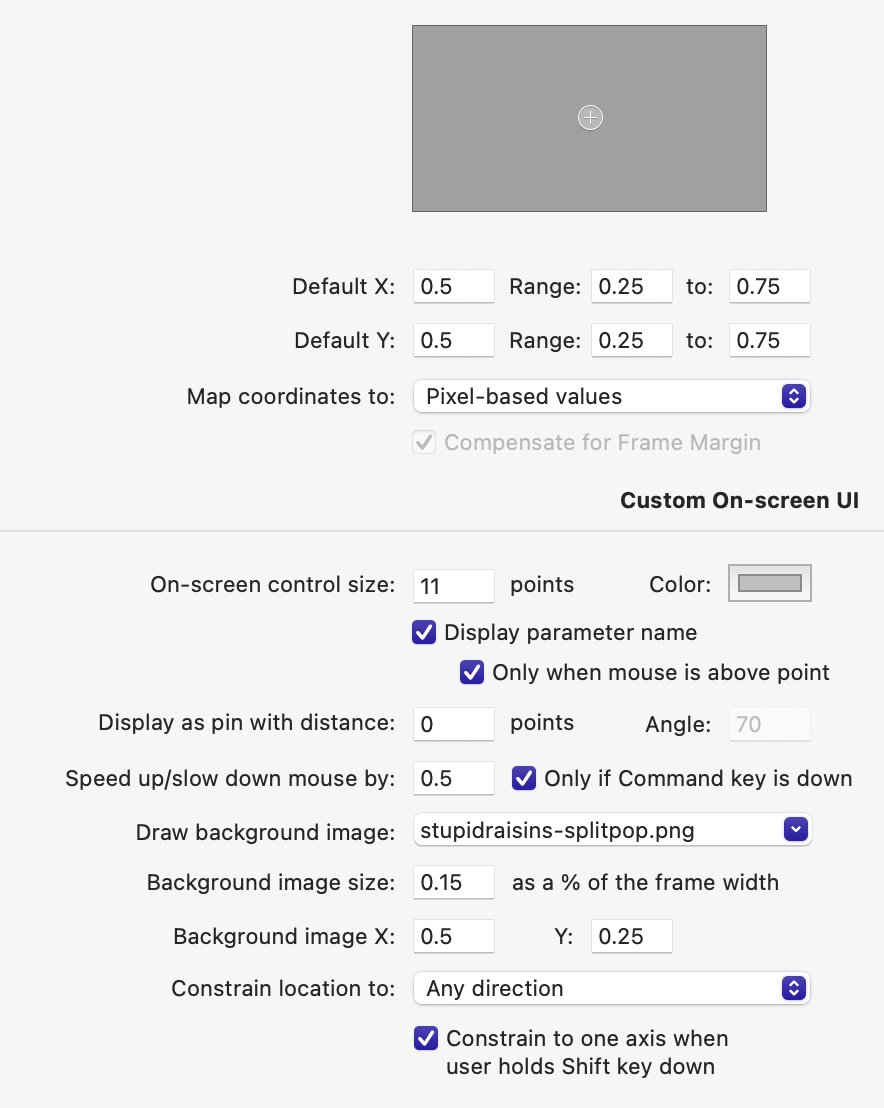
The Default X and Default Y text boxs let you manually enter the initial location of the point within the frame.
The Range: ... to: ... text boxes let you restrict the coordinate of the point to the given range. To allow the user to only position the point within the frame, set both minimum values to 0 and both maximum values to 1. Leave a field empty if you do not with to restrict the coordinate in that particular direction.
The Map coordinates to option lets you control how the point coordinates will be converted when fed to the composition inputs:
- Choose Pixel-based values if the coordinates are to be expressed in pixel-based units, as required by Core Image filters.
- Choose Quartz Composer coordinate system if the coordinates are to be expressed in units relative to the 3D viewing volume defined by the composition.
The On-screen control size option lets you assign a custom size to the on-screen controls available in Final Cut Pro and Motion. The default value is recommended for all situations except dividers (discussed below). The size is expressed in points, so as to present the same clickable area to the user regardless of the resolution of the display being used. On standard displays, a point is equal to a pixel. On Retina/HiDPI displays, a point is equal to the area occupied by 4 pixels. The next option, Color, lets you choose the overall tint for the on-screen control drawn in Final Cut Pro and Motion. When a non-zero value is entered in the Display as pin with distance option below, it makes sense to pick a color that highlights the different appearance and behavior of this particular on-screen control.
The Display parameter name option lets you control whether the point parameter is labeled when the user moves the mouse over the on-screen control. The default behavior can be refined via the next option, named Only when mouse is above point. Disable the latter option if you wish point controls to always be labeled in the canvas.
The Display as pin with distance option lets you change the appearance of the on-screen control. When the offset is non-zero, instead of the on-screen control being displayed at the coordinates of the point, it is displayed at the given distance in the direction specify via the Angle text box. FxFactory draws a thin, fading line from the control handle to the coordinate of the point, giving it the appearance of a pin:
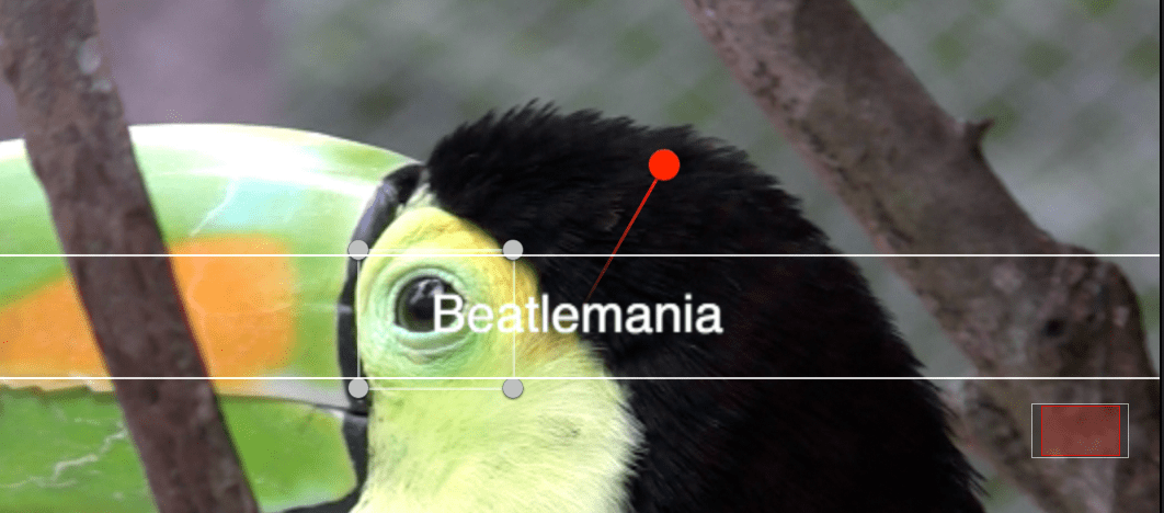
Why is this necessary at all? When creating Motion Templates for Final Cut Pro there are limits to the coexistence of built-in on-screen controls and those provided by third-party plug-ins. For example, if coordinate of the point coincides with the location of an editable title area, Final Cut Pro will funnel all mouse events to the title, making it impossible for the user to reposition the point within the Canvas. The solution is to use the Display as pin with distance option to offset the clickable handle just enough to occupy an area of the Canvas it does not share with any other on-screen controls.
The Speed up/slow down mouse by option lets you control how fast the point parameter location is updated on screen. By default, the speed is only changed when the shift key is down, and it is slowed down by 0.5 (50%). Disable the Only if Shift key is down option to change the speed under all circumstances.
Background Images
The Draw background image option lets you select one of the image assets embedded in the product. The image will be drawn above the output of the plug-in, and below the actual on-screen control that allows the point to be repositioned in the Canvas.
The Background image size text box lets you determine the dimensions of the background image as a percentage of the frame width. The value of 0.25 corresponds to 25% the width of the frame. Keeping the dimensions relative to the width of the frame allows the same background image to look consistent no matter what the canvas zoom level or project size are. The choice of scaling the background image relative to the width of the frame instead of its height derives from the fact that height can shift more drastically when the host application switches from processing individual fields vs progressive frames in an interlaced sequence.
The image is drawn at the location specified by the Background image X/Y text boxs.
This feature, when used in tandem with constraints on the point location, allows you to create rich on-screen UIs. An example is to provide a color wheel or dial to allow the user to select colors or adjust the strength of a parameter.
The background image is only drawn when on-screen controls are visible for the effect_to prevent the user from accidentally burning in the on-screen UI of your plug-in into the final output.
Constraints
The Constrain location to popup menu lets you choose among the following options:
- Any direction: the user can move the point parameter anywhere on the canvas (but within the range defined above, if there is any.)
- Horizontal axis / Vertical axis the user can only move the point over the X or Y axes. Then this option is selected, an additional popup menu named Divider lets you control the appearance of the point parameter:
- None: continue to display the point parameter with a round-shape even if the location is restricted to a particular axis.
- Thin divider with point control: a thin divider line is drawn on-screen, along the fixed axis. The standard, round-shaped point control is still displayed, and it is the only way the user can reposition the point.
- Thick divider without point control: a divider is the only way the user can reposition the point. No round-shaped indicators are drawn on screen. The thickness of the divider is determined by the value set above, in the On-screen control size text box.
- Distance from location: the user can only reposition the point within a given distance from a given location. By default, the location used by this constraint is the initial location of the point. Two fields labeled From X/Y let you specify a different location to be used for this constraint. Another text box named Maximum distance lets you specify how far the point can be dragged away from the location. The distance is measured as a percentage of the frame width. For example, a value of 0.05 means that the point will be allowed to be repositioned no more than 5% away from the given location in the frame. It is also possible to constrain movement along one axis only when the user is holding down the Shift key, by enabling the option Contrain to one axis if Shift key is down.